Project Story · Visual Branding
For most people, a hospital gets associated with cold rooms, tension, and uncertainty. That atmosphere quietly builds a stigma that a hospital visit has to be a stressful experience.
Yet a patient's healing process and comfort aren't shaped only by fast medical handling or friendly staff. The visual environment that greets them the moment they step in matters just as much.
RS Ubaya understood exactly how much weight this visual communication carries. Through a deliberate visual identity design, RS Ubaya set out to shift how people see a hospital: turning it into a space that feels safe, calm, and comfortable.
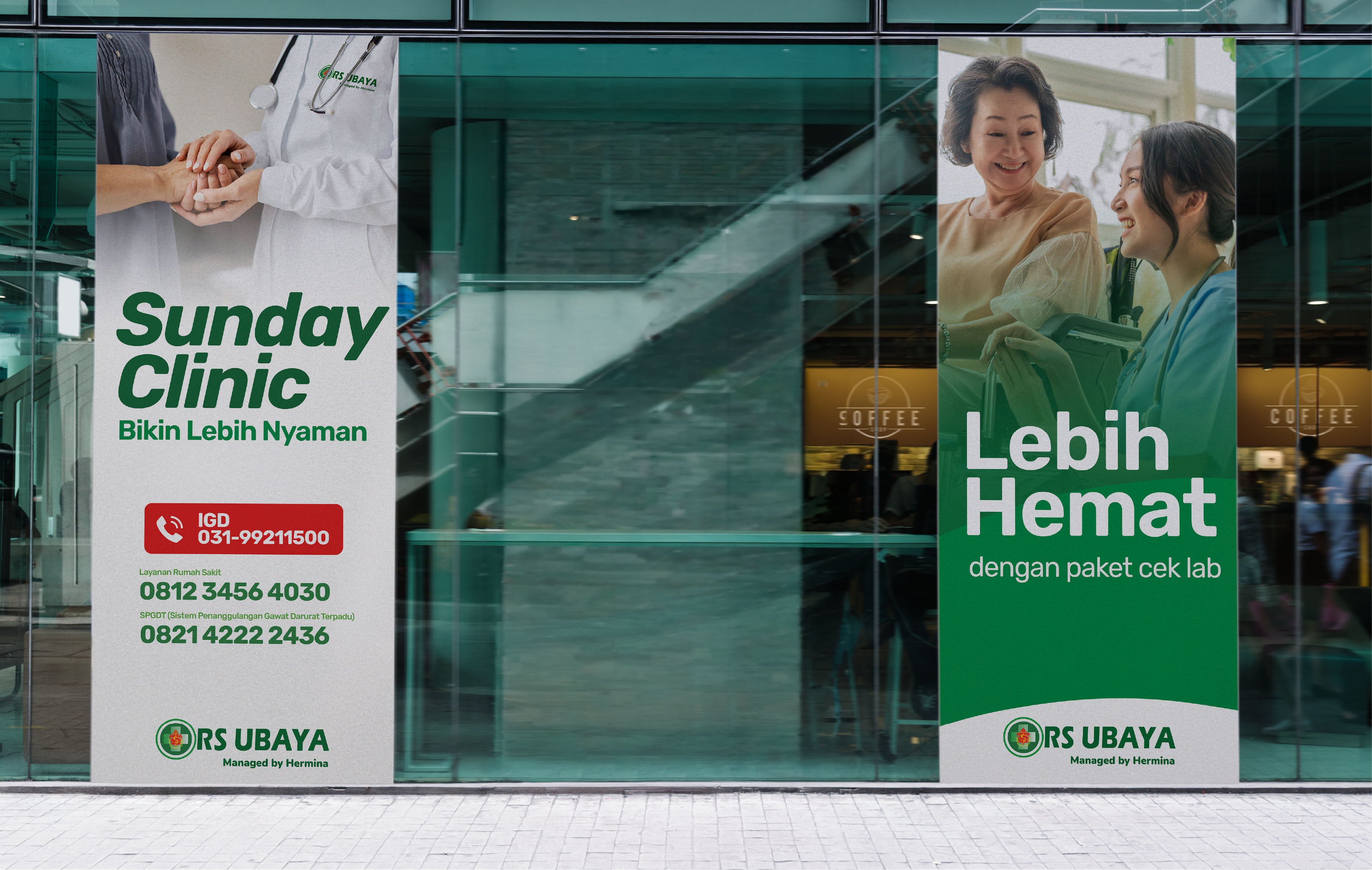
The green in RS Ubaya's logo became the main foundation for building this visual comfort. In color psychology, green is tied to freshness, growth, and a sense of calm.
But applying green here wasn't just about stamping a logo onto every piece of media. RS Ubaya extended that single element into a solid, comprehensive color palette. Green became the dominant, consistent color across every visual touchpoint, from digital communication and printed materials to wayfinding signage inside the hospital itself.
That consistency builds a cohesive visual language. When a visitor's eyes catch that steady, gentle rhythm of color, their anxiety can start to ease, little by little.
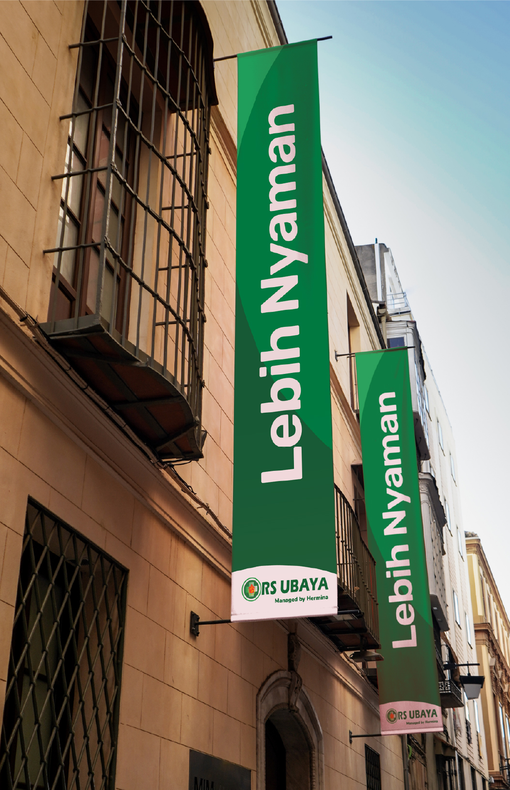
Good visual design in healthcare isn't just about making things look nicer. It's about delivering clarity. Through tidy typography, clean layouts, and a supergraphic system that feels dynamic yet calming, RS Ubaya managed to turn often-complicated medical information into something patients and their families can actually understand.
This approach shows just how much power visual design holds over user experience. When a hospital presents something consistent and comfortable to look at, the brand is quietly sending a message to the public: here, patients are in the right hands, cared for, and at ease.