Independent Analysis
Looking like nothing changed is exactly the point. Here's how JKR evolved one of the world's most recognizable icons without losing what people already loved.
Looking at KFC's latest visual identity overhaul, most people's first reaction is probably a question: what actually changed? The red-and-white stripes are still there, Colonel Sanders still graces the packaging, and red, white, and black remain the primary colors.
That reaction isn't a failure. It's actually proof that the strategy designed by leading branding agency JKR worked.
The biggest challenge in rejuvenating a global giant brand comes down to one critical question: how do you evolve one of the world's most iconic visual identities without throwing away what consumers have loved for decades?
KFC had already proven the power of a more relaxed, human character back in 2018. At the time, KFC's UK arm hit a chicken supply crisis that forced many outlets to temporarily close. Instead of a stiff press statement, KFC ran an apology ad that rearranged its logo's letters into "FCK."
That honest, witty, deeply human message instantly became one of the most legendary ads in branding history. The moment proved that the distance between a giant brand and its customers can shrink the moment a brand is brave enough to show up closer and looser.
Now, through its global rejuvenation project, KFC wants to close that gap everywhere, for good.
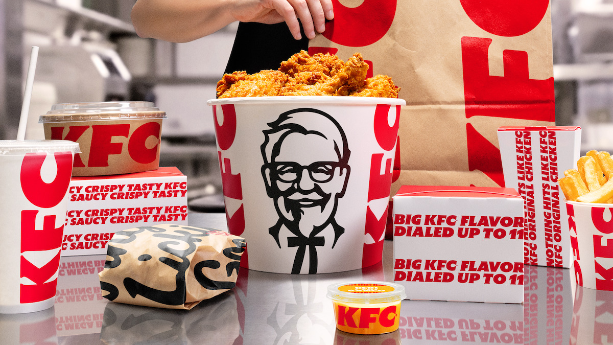
To modernize the brand without losing its historical roots, JKR stopped treating the bucket as just chicken packaging and turned it into a core communication pillar. They call this system the Bucketverse.
Under this new system, the bucket packaging was redrawn and standardized globally. The bucket now functions as an extension of the logo itself, a flexible frame that can carry food photography, illustration, or campaign messaging.
Some of the detail updates introduced include:
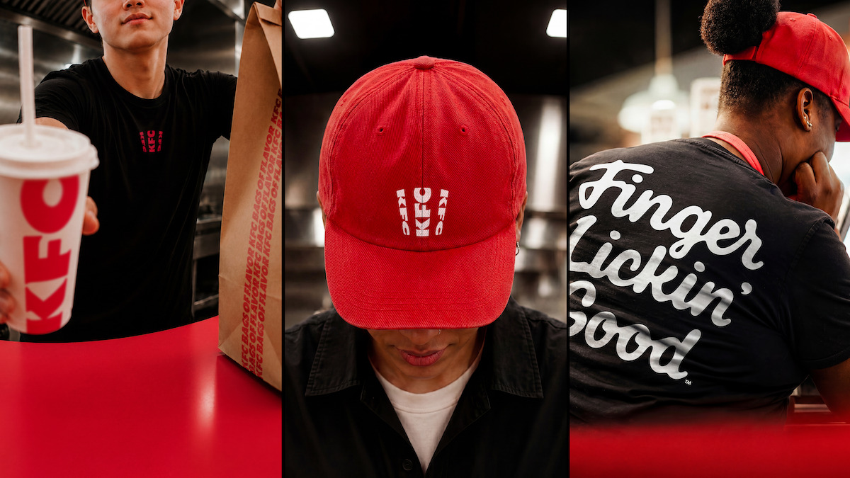
Another smart move in this new visual system is the use of flexible illustration. KFC partnered with various international artists to create an illustration style that can adapt to each country's local market. This keeps KFC feeling close to local culture without discarding its global identity standards.
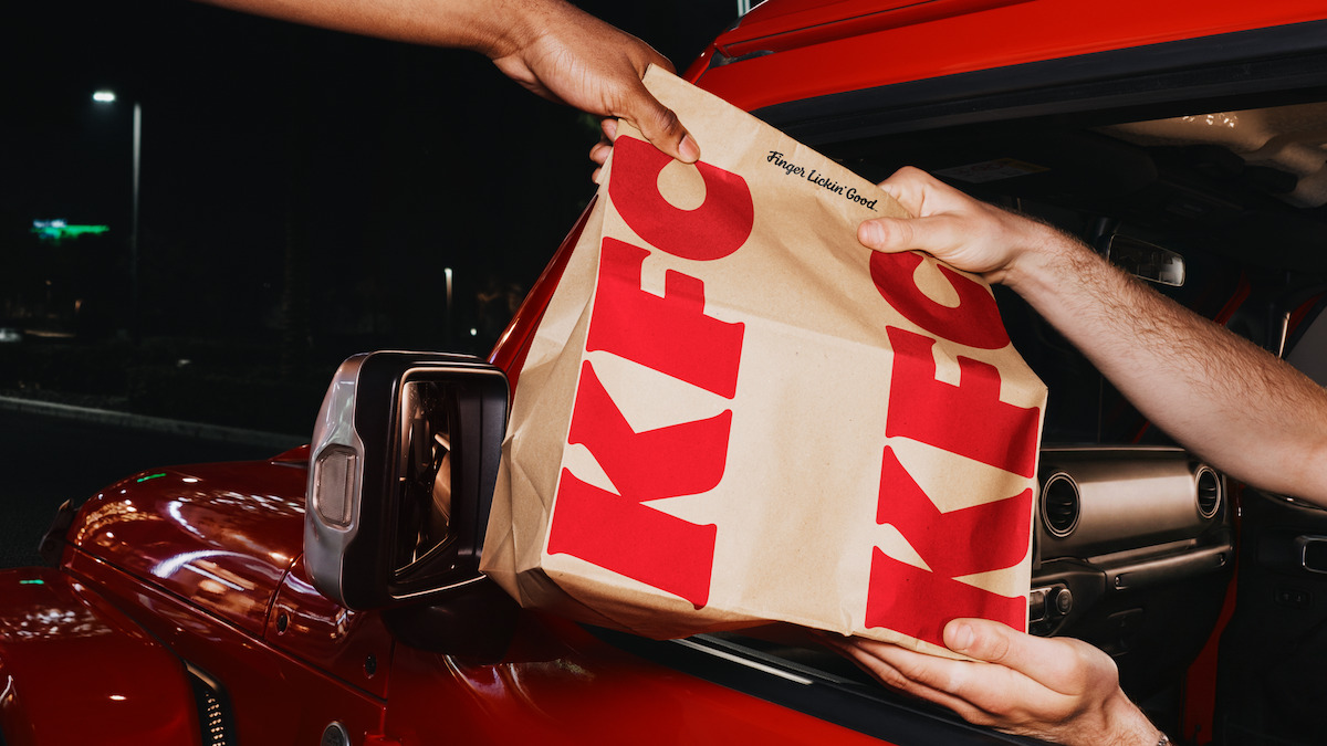
KFC's rebrand proves that major change doesn't always have to tear down what's already been built. A successful visual identity evolution is about sharpening the message, tidying up the communication system, and making existing iconic elements work harder for the business.
Through the Bucketverse, KFC shows how to rejuvenate a classic brand: keep its core values, refine its execution system, and make every brand interaction feel more alive to a modern audience.
Read Next
Back to Home →